Branding Guidelines
Official guidelines and assets for using the DartNode brand. Ensure consistency and recognizability across all platforms.
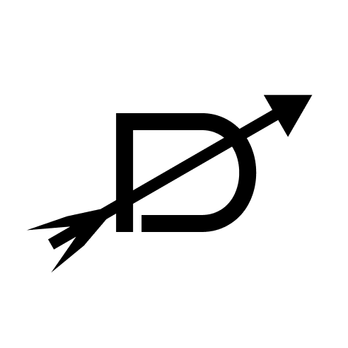
Our Logo
Our primary logo combines a stylized "D" with an arrow, symbolizing forward momentum and precision, alongside the "DartNode" logotype.
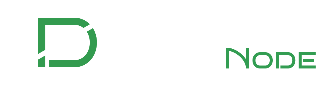
Full Color Logo (Preferred)
On Dark Background
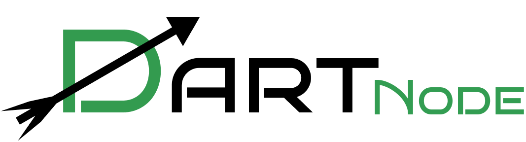
On Light Background
Monochromatic Logos
White Logo (on Dark)

Black Logo (on Light)
Brand Icon
The DartNode icon is a simplified version of our logo, suitable for use in small spaces, favicons, and app icons.
Color on Light
Color on Dark
Black on Light
White on Dark
Color Palette
Our brand colors are integral to our identity. Use these colors consistently across all materials.
Usage Guidelines
To maintain brand consistency, please adhere to the following guidelines when using our assets.
-
Respect Our Rights
DartNode is a registered trademark in the United States of America owned by Snaju Inc. Invalid use of our likeness and/or brand will result in enforcement of our rights under the law.
-
Clear Space
Always maintain a minimum clear space around the logo. This space should be at least the height of the "D" in the icon.
-
Minimum Size
Ensure the logo is never reproduced at a size that compromises its legibility. The "DartNode" text should always be clearly readable.
-
Don'ts
- Do not stretch, condense, or alter the proportions of the logo
- Do not change the logo's colors outside of the provided variations
- Do not place the logo on busy or patterned backgrounds
- Do not add drop shadows, outlines, or other visual effects
- Do not attempt to recreate the logo or its elements
Legal Notice
DartNode is a registered trademark of Snaju, Inc.
Use of the DartNode name, logo, or any associated branding assets is protected under applicable trademark laws. This page is provided for informational purposes only and does not constitute a license to use the DartNode trademark or branding materials in commerce or for promotional purposes.
Any commercial use, including but not limited to advertising, product packaging, service offerings, or affiliation claims, must be expressly authorized in writing.
To request a license or permission to use the DartNode brand in commercial applications, please contact us. Unauthorized use may result in legal action.
Download Assets
Download official DartNode branding assets for your projects.